Remotely
Remotely is an app that helps people quickly find work or study spots with the amenities they need, like wifi, restrooms, and available seating.

Project Overview
The Problem
Currently, many people who work remotely find it time-consuming and laborious to find a place that meets all their needs because the information is not easily accessible and congregated into one place.
The Solution
With Remotely, I focused on getting this information to people as quickly and as efficiently as possible by collating all the information into one place and keeping screens as simple and straightforward as possible.
My Role
Sole UX/UI Designer
Timeline
5 days (Modified GV Sprint)
Tools
Sketch, PostUp, iPhone, pen and paper
DAY 1
Pain Points & User Maps
Upon first reviewing the user research, interview, and persona, I got a good idea of what users current pain points are: that it’s difficult to find places with the amenities they need—namely wifi, restrooms, and somewhere that’s not too loud or crowded.

Based on the research provided to me by Bitesize UX, I brainstormed on a few possible user maps that our persona, Nina, might take to quickly find somewhere to work with the amenities she needs. I decided on the third red route, which featured a map that would inform people about the availability of seats in potential work spots around them.

DAY 2
Lightning Demos, Crazy 8s Sketches, & Solution Sketches
After that, I conducted a round of lightning demos to research similar apps. I realized that there wasn’t much competition for an app tailored to finding spaces for remote workers to work. The closest things I had were what people were already using: Yelp, Google Maps, Apple Maps. Since these apps are very map-centric, I set out to examine other map-centric apps: Waze, Snapchat, and Citibike.

Yelp
What I liked about Yelp was that they put photos of the spots at the top and made it easy to filter photos by the inside. However, everything else about the app was too much irrelevant information for someone who was just looking for information about working remotely.
Google Maps
One of the best features about Google Maps was that it showed the “popular times” of an establishment, which could be really useful in planning when to visit. However, these popular times refer to how long food takes to arrive rather than how crowded it is.
Apple Maps
Apple Maps did an elegant job showing information about amenities in an easy-to-read list with icons and showing important relevant information (like wifi) front and center.
Waze
Waze, an app that gives crowd-sourced live reports on traffic, has a great interface that shows users what’s going on in real-time. I really liked this model because perhaps users could know how much foot traffic was in a coffee shop based on something crowd-sourced like Waze.
Snapchat
Snapchat, a social medium, was another app that had an interesting map concept. Their Snap Map feature shows heat maps of different photos and videos people post to the public sphere. Users can click on different areas to see photos and videos of what’s going on. This could be useful for users who want to see how crowded or busy a spot is in semi-real time.
Citibike
Lastly, Citibike, a bike-sharing app, is another that I thought had an interesting map concept. On Citibike’s main page, users immediately see how many bikes/available slots are located around them. This concept could be useful to users who would like to know how many available spots are at coffee shops or work spaces around them.
After that, I conducted a Crazy 8s sketch session and iterated on a number of ideas. The one I ended up choosing was, perhaps, the simplest: a simple search screen, in the vein of Google, that allowed users to toggle the amenities they wanted. If users wanted simple, fast, and informative, I would give it to them.

As I drew a solution sketch, I tried to figure out a way to incorporate all the important elements into the app: wifi, restrooms, noise level, hours, price, crowdedness, available seating, photos, and directions.
DAY 3
Storyboarding
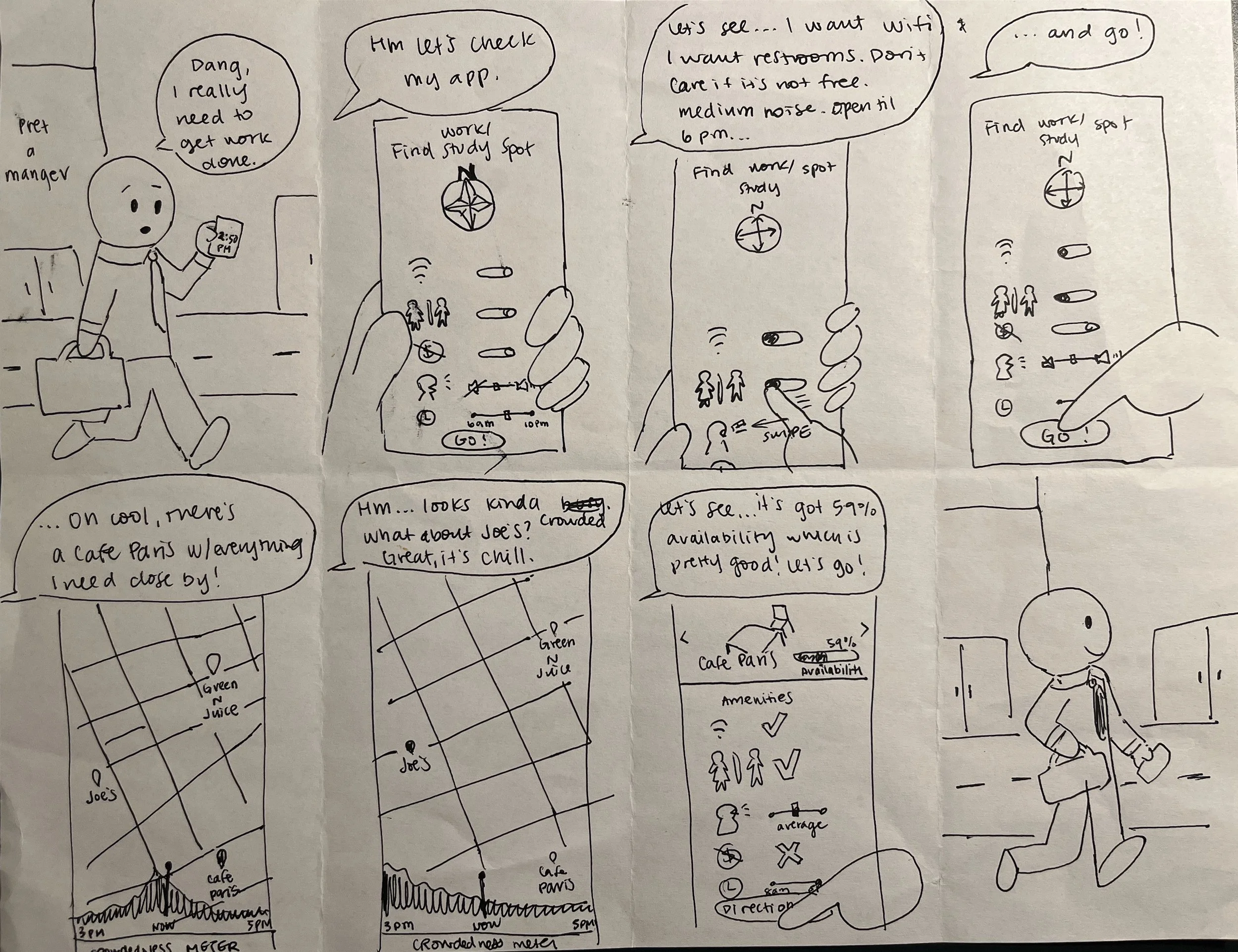
While storyboarding, I put myself in the shoes of the user again and imagined the dialogue they might have while using the app. This helped me to stay user-focused as I built the screens and features. I figured a user who needed to get some work done remotely wanted as few screens as possible, with all the information they needed laid out in front of them.
DAY 4
Prototyping
As I was prototyping, I considered having the main page have a map in the background. However, I realized this made the interface unnecessarily cluttered and antithetical to the simplicity that user’s so desired. Instead, I kept the main page extremely simple and straightforward, with everything users needed to search for up front.

The results are shown on a map, and once users click on different spots, they can see how crowded they typically are at the moment and before and after as well. When they swipe up, users can get more information about the location including what amenities they have, photos, how available they are, and an option to get directions.
I struggled with figuring out how to place information about a location’s crowdedness and their information card. I wanted the information to be front and center on the map instead of in the Amenities card because I figured one of the most important things for users might be how crowded a place is. So I settled on creating a card on the bottom to not crowd users with too much information.
Since users take different modalities of travel, I built in the function to choose which modality they wanted right into the Directions button to save users from having to access yet another screen.
Day 5
User Testing
Now that my prototype was done, I tested it with a sample pool of users who were familiar with working remotely. These users were 30-38 years old and lived in big, metropolitan areas.
Goals
See if users understand the flow of the red route
Observe if users can get from start to finish of red route without much confusion or friction
See if users understood how to use the amenities toggles as well as how to find information about a location’s amenities
Findings
Most users did not need much help to get from point A to point B and navigated the red route successfully
Users hesitated or took a moment to figure out how to access the amenities card
One user did not understand the concept of the Hours Open slide bar and had to be prompted to figure out how to use it
Next Steps
Make Amenities card pop up whenever a user clicks on a place and fold the Crowdedness Meter into the Amenities card to prevent a user from having to tap twice to access a location’s information
Retool the Hours Open slide bar to make more sense for users and employ drop-down menus instead
Extra Credit
Mood Board, Style Guide, and Hi-Fidelity Prototype
I wanted to see this project through to the hi-fidelity prototype stage, so I decided to create a mood board and style guide.
While I am still working on the prototype, I can share what I have so far.
Mood Board
Key words: speed, coffee, remote
A variety of browns to represent coffee
A zip of yellow & diagonal lines for speed
Simple lines that still express movement

Style Guide
Color Palette
Primary colors: brown and green make sense since most remote workers look for coffee shops
Secondary color: dark blue rounds out the trifecta of brown, green, and blue as colors that represent nature and academia (where a lot of work gets done)
Accent colors: the bright yellow and pink lend a bit of energy to the palette without being too intense
Fonts
Lato is a sans-serif font with a narrower width and plenty of variety. It looks great in italic, which can be used to signal movement
Suez One just has that coffee look to it! With its wider widths and warm, inviting serifs, users can feel at ease knowing this wise font has all the information they need

Reflections
Although this is an ongoing project, I’ve already been met with some fantastic takeaways:
Although the temptation is there to overcomplicate things with infinite added features, it would do one well to remember that functionality comes first. In the context of this project, adding a Crowdedness Meter to the map page in the name of “having all the information up front” took away from users’ actual ability to swipe the bottom tab upward to receive information about a coffee shop.
Creating a slide bar for “Hours Open” might work in some contexts, but it was too complicated in this one. Unless I’m able to find a different way for users to indicate that they want a coffee shop to be open late, there’s nothing wrong with a tried and true drop-down menu.
